
Occupancy figures explained
Four cards sit across the top of the Occupancy page. Each answers a different question about the period you've chosen.
Before you start
Plan: Available on all plans.
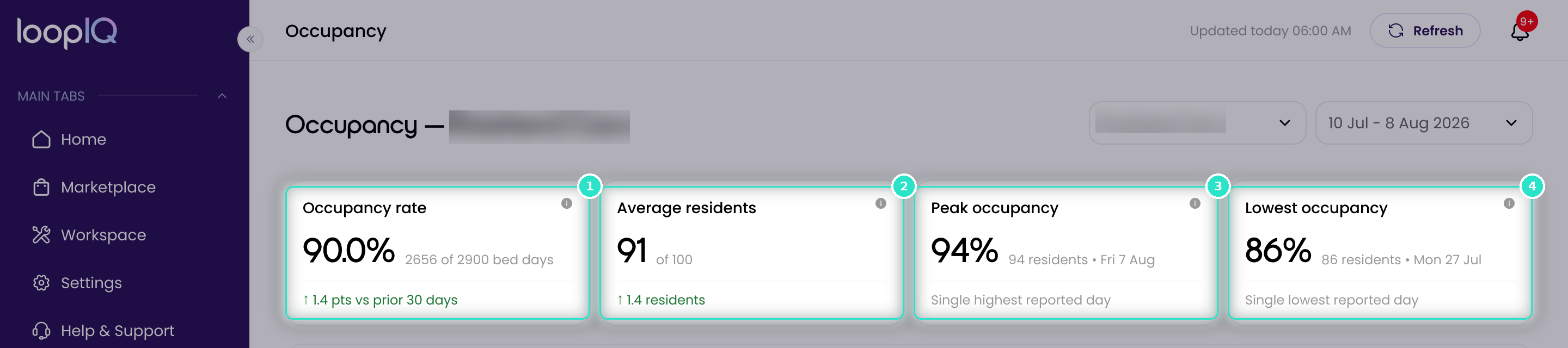
The cards
- Occupancy rate (1): occupied bed days as a share of available bed days, e.g. 2656 of 2900 bed days.
- Average residents (2): residents on a typical reported day. The figure beside it (e.g. of 100) is your approved places.
- Peak occupancy (3): the single highest reported day in the period, with its resident count and date.
- Lowest occupancy (4): the single lowest reported day in the period, with its resident count and date.
How the figures are worked out
Available bed days are your approved places multiplied by the number of reported days, not calendar days. Read this line to see how many days sit behind a percentage.
Days Services Australia hasn't reported are left out of every figure, not counted as zero. A figure only describes the days that have arrived.
- Comparison line: Occupancy rate and Average residents compare against the window just before yours, e.g. 1.4 pts vs prior 30 days.
- Decimal places: Occupancy rate shows one decimal place; peak and lowest are whole numbers.
- Comparing facilities: compare bed days lines as well as percentages, because facilities differ in places and reported days.
Important: Below 50% of days reported, the cards show no figures. See When Occupancy has no figures to show.
Was this article helpful?
Can't find what you are looking for?
Loop IQ customers - log a support ticket.
Not yet a customer? Email our support team.
 Log a support ticket
 support@loopiq.com.au