
The daily occupancy chart explained
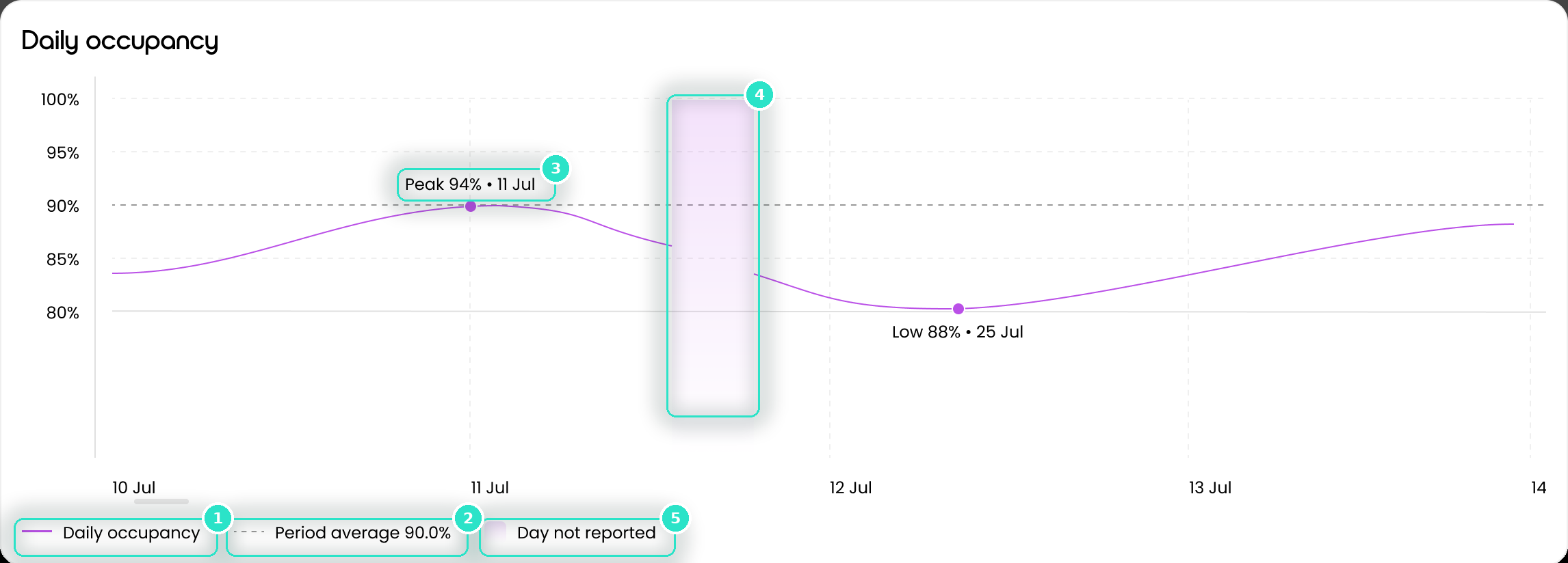
The Daily occupancy chart shows the shape of the period behind the four cards, one point per reported day.
Before you start
Plan: Available on all plans.
Reading the chart
- Daily occupancy (1): the solid line, one point per reported day.
- Period average (2): the dashed line. Its figure shows in the legend, e.g. Period average 90.0%.
- Peak and low labels (3): mark the highest and lowest reported days, e.g. Peak 94% • 11 Jul.
- Day not reported (4, 5): shaded on the chart (4) and named in the legend (5). The line doesn't run through these days.
Unreported days usually sit at the right of a recent period, where data hasn't arrived yet.
The vertical axis fits the range of your data rather than starting at zero. A steep-looking line may move only a few points, so read the axis first.
Important: Below 50% of days reported, the chart shows single points with no line or average. See When Occupancy has no figures to show.
Was this article helpful?
Can't find what you are looking for?
Loop IQ customers - log a support ticket.
Not yet a customer? Email our support team.
 Log a support ticket
 support@loopiq.com.au